Version
- 1.0 – Release
Number of Blueprints: 21
Supported Development Platforms:
Windows: Yes
Mac: Yes
版本
- 1.0-发布
蓝图数目:21
支持的开发平台:
Windows:是的
Mac:是的
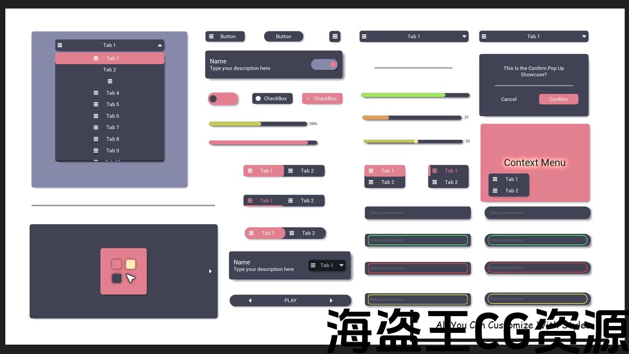
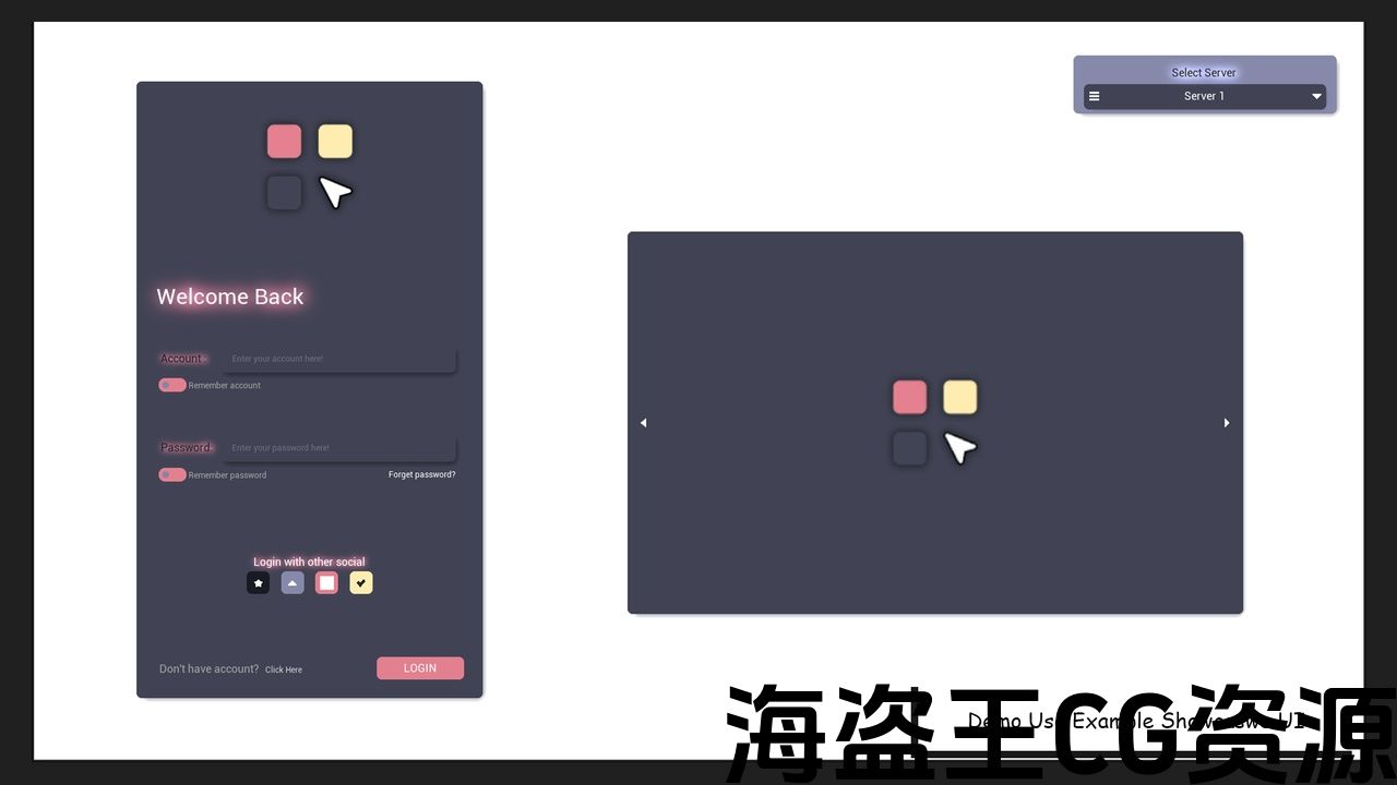
Widget Elementor is a comprehensive UI component toolkit designed to enhance user interface development with a range of versatile elements. It includes switchers for toggling settings, customizable buttons, card labels for clear content organization, and background cards to highlight important information. Additionally, it features interactive sliders and progress bars to provide visual feedback to users. With its modular design, Widget Elementor allows developers to easily integrate and style these components, making it an ideal solution for building modern, responsive, and user-friendly interfaces.
Key Features:
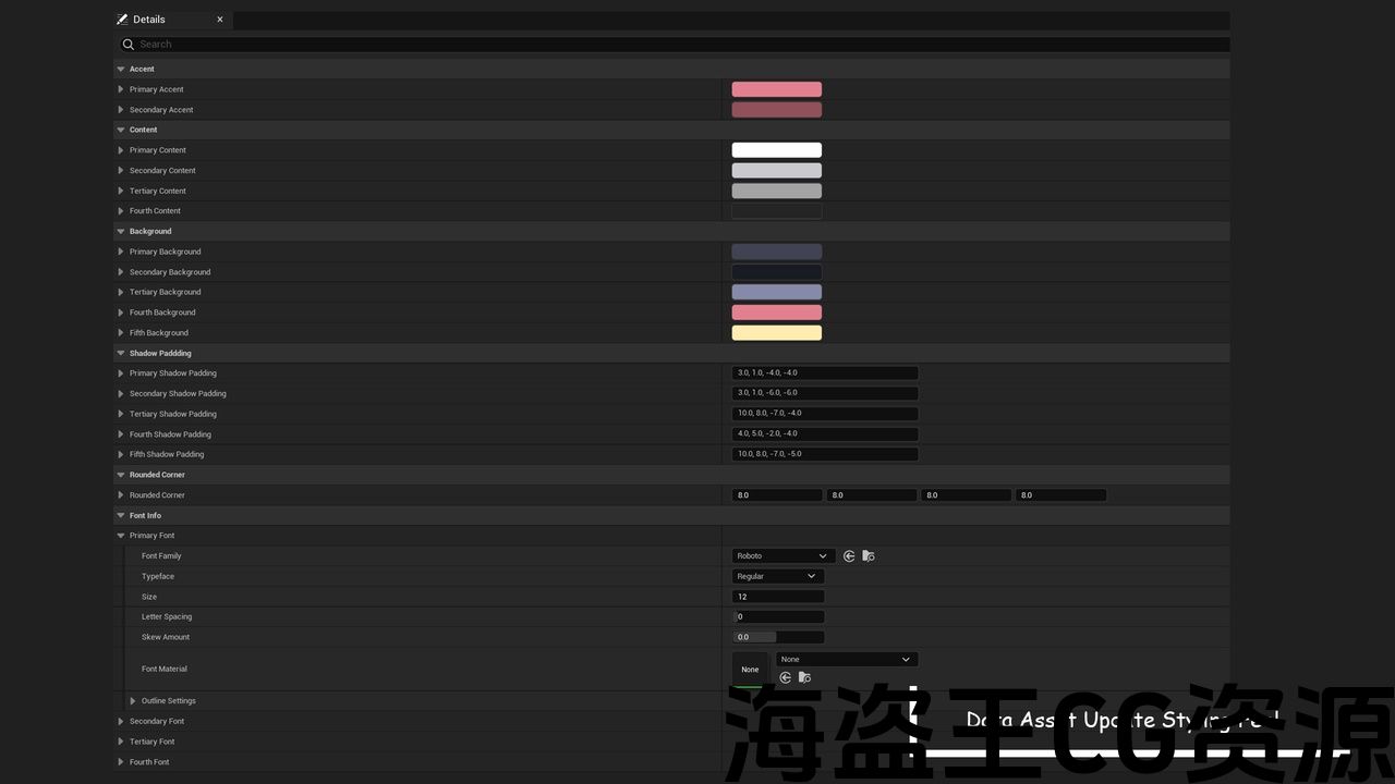
- Fully Customizable Components: Easily adjust every UI element to match your design requirements.
- Pre-Built UI Elements: A rich library of ready-made widgets including Switchers, Buttons, Card Labels, Sliders, and Progress Bars.
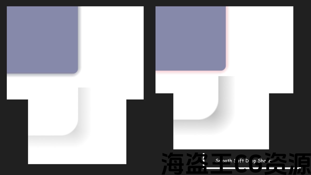
- Soft Drop Shadow Support: All components come with smooth, customizable drop shadow effects for a modern, polished look.
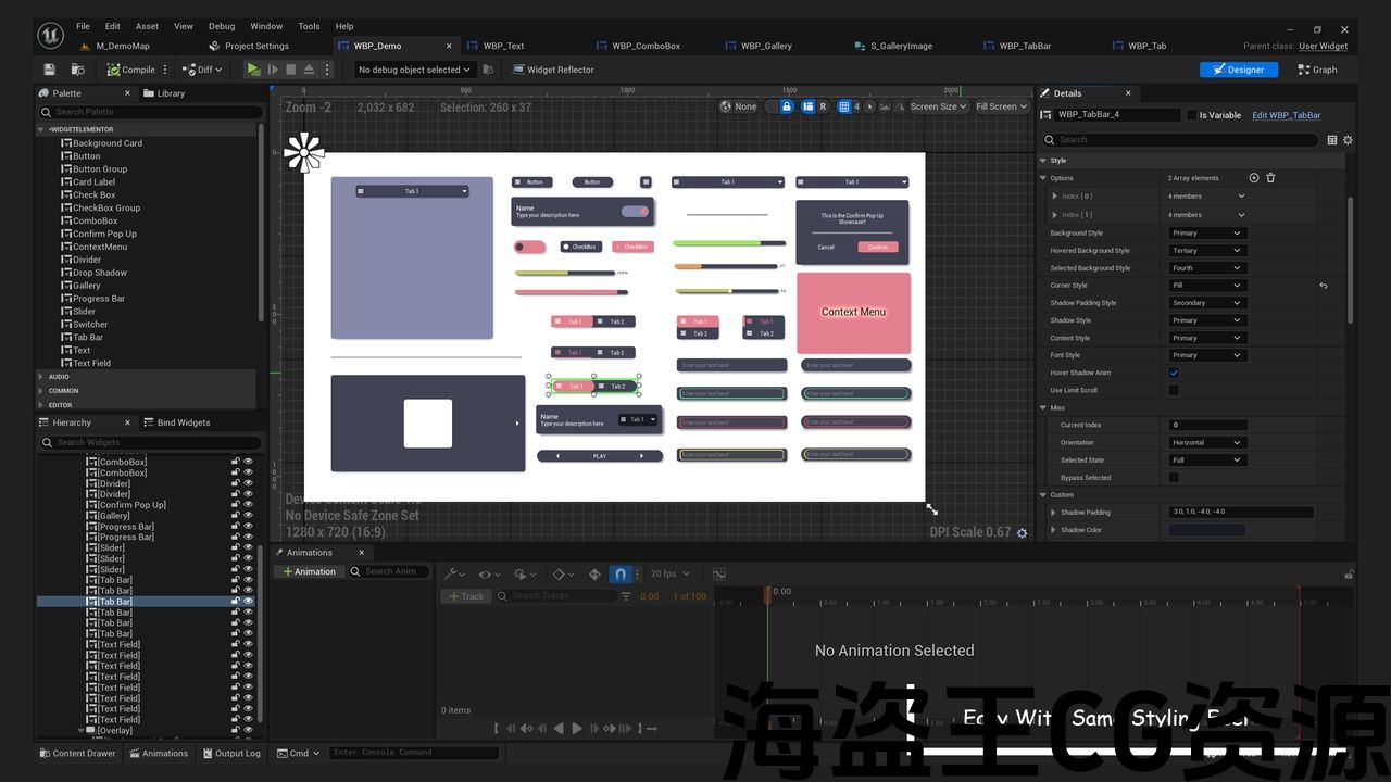
- Drag-and-Drop Integration: Effortlessly incorporate widgets into your project with intuitive drag-and-drop functionality.
- Lightweight and Optimized: Designed for performance, ensuring smooth operation in both small and large-scale projects.
- Cross-Platform Compatibility: Ensures consistent experience across all devices and screen sizes.
- Built-in Responsive Design: Automatically adjusts layout and dimensions for mobile, tablet, and desktop views.
- Interactive Feedback: Boost user engagement with dynamic progress bars, hover effects, and real-time state changes.
- Modular Architecture: Choose and use only the components you need for a streamlined and efficient workflow.
- Real-Time Preview: Instantly view changes with live previewing during development.
- Comprehensive Documentation: Includes detailed guides and examples to ensure fast setup and customization.
✅Create a Login Page In 8 Mins: Video
📚Documentation: Doc
小部件元素 是一个全面的UI组件工具包,旨在通过一系列多功能元素增强用户界面开发。 它包括用于切换设置的切换器,可自定义按钮,用于清晰内容组织的卡片标签以及用于突出显示重要信息的背景卡片。 此外,它还具有交互式滑块和进度条,可为用户提供视觉反馈。 凭借其模块化设计, 小部件元素 允许开发人员轻松集成和样式化这些组件,使其成为构建现代,响应和用户友好界面的理想解决方案。
主要特点:
- 完全可定制的组件:轻松调整每个UI元素以匹配您的设计要求。
- 预构建的UI元素:丰富的现成小部件库,包括切换器,按钮,卡片标签,滑块和进度条。
- 软阴影支持:所有组件都带有平滑,可定制的阴影效果,以获得现代,抛光的外观。
- 拖放集成:通过直观的拖放功能,轻松地将小部件合并到您的项目中。
- 轻量级和优化:专为性能而设计,确保小型和大型项目的平稳运行。
- 跨平台兼容性:确保所有设备和屏幕尺寸的一致体验。
- 内置响应式设计:自动调整移动、平板电脑和桌面视图的布局和尺寸。
- 互动反馈:通过动态进度条,悬停效果和实时状态更改提高用户参与度。
- 模块化架构:选择并仅使用您需要的组件,以实现精简高效的工作流程。
- 实时预览:在开发过程中使用实时预览即时查看更改。
- 综合文件:包括详细的指南和示例,以确保快速设置和定制。
▪在8分钟内创建登录页面: 短片
📚文件: 医生

评论(0)