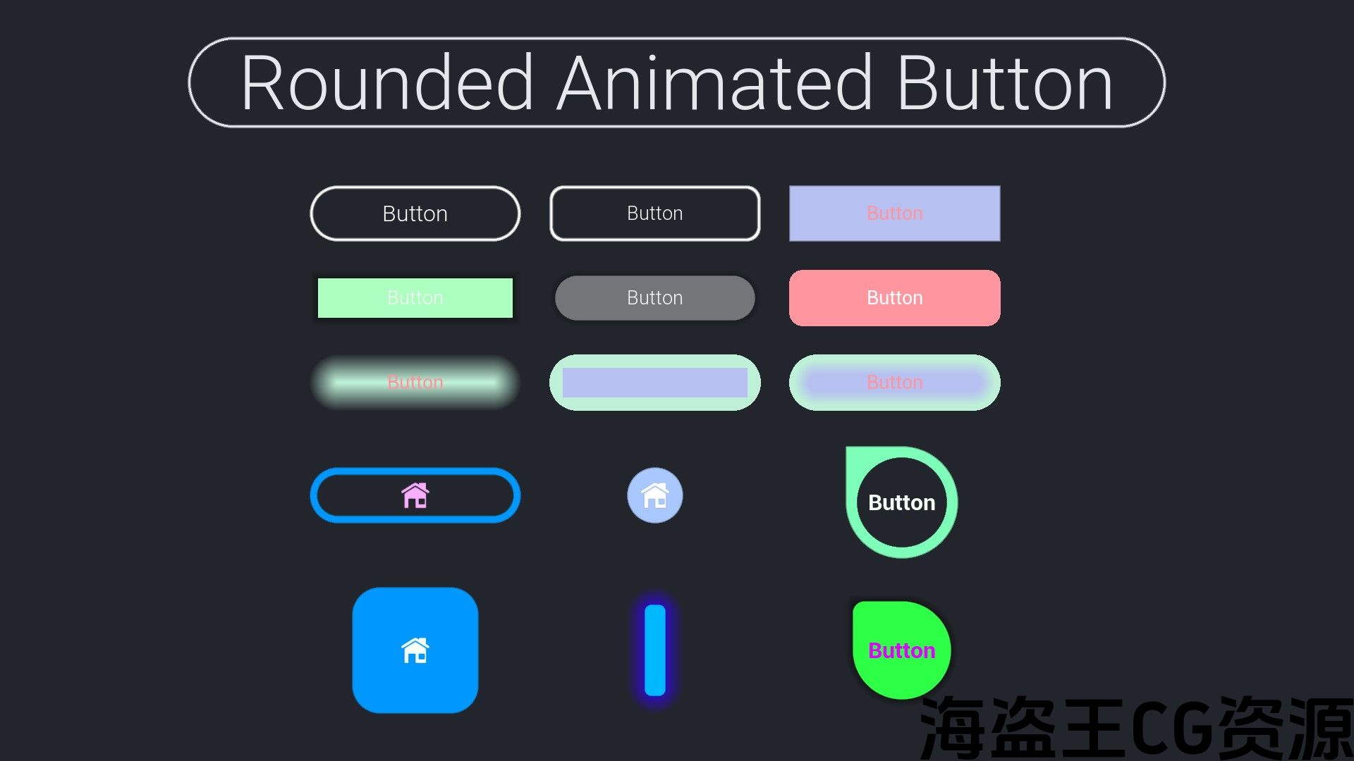
Rounded animated customizable buttons and borders (UMG) to easily create user interfaces.
圆形动画可自定义按钮和边框(UMG),可轻松创建用户界面。
Features:
- RoundedAnimatedButton widget
- RoundedBorder widget
- Easy installation/utilization
- Customizable
- Compatible with C++ and Blueprints
Number of Blueprints: 2
Number of C++ Classes: 3
Network Replicated: No
Supported Development Platforms: Win64, Win32, Mac, Linux, HTML5 (probably works on consoles too)
Supported Target Build Platforms: Win64, Win32, Mac, Linux, HTML5 (probably works on consoles too)
Documentation: See the video or the ExampleInterface Blueprints in the example project.
特征:
- RoundedAnimatedButton小部件
- RoundedBorder小部件
- 易于安装/使用
- 可定制
- 兼容C++和蓝图
蓝图数目: 2
C++类数: 3
网络复制: 非也。
支持的开发平台: Win64,Win32,Mac,Linux,HTML5(可能也适用于控制台)
支持的目标构建平台: Win64,Win32,Mac,Linux,HTML5(可能也适用于控制台)
文件: 请参阅示例项目中的视频或ExampleInterface蓝图。
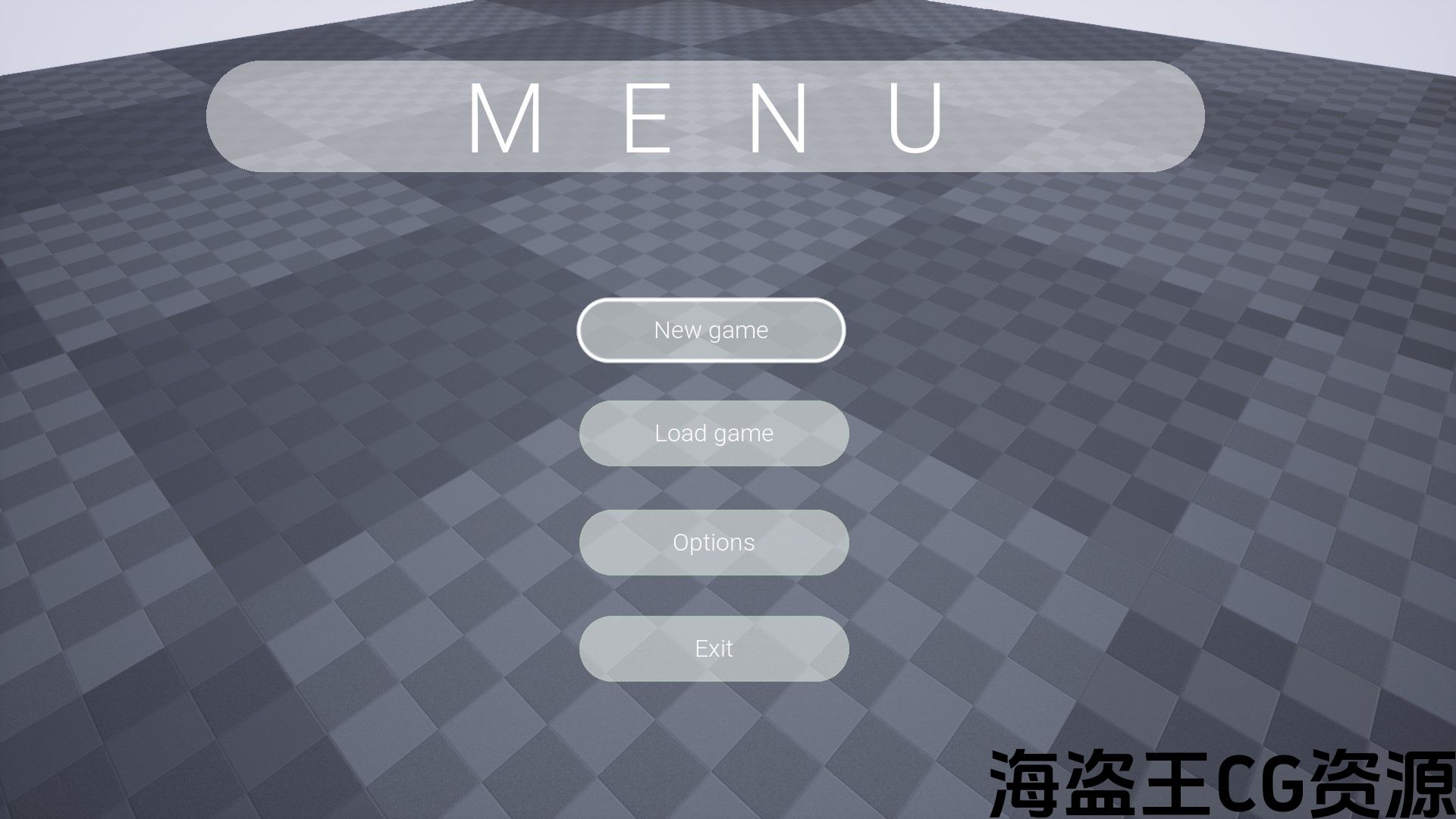
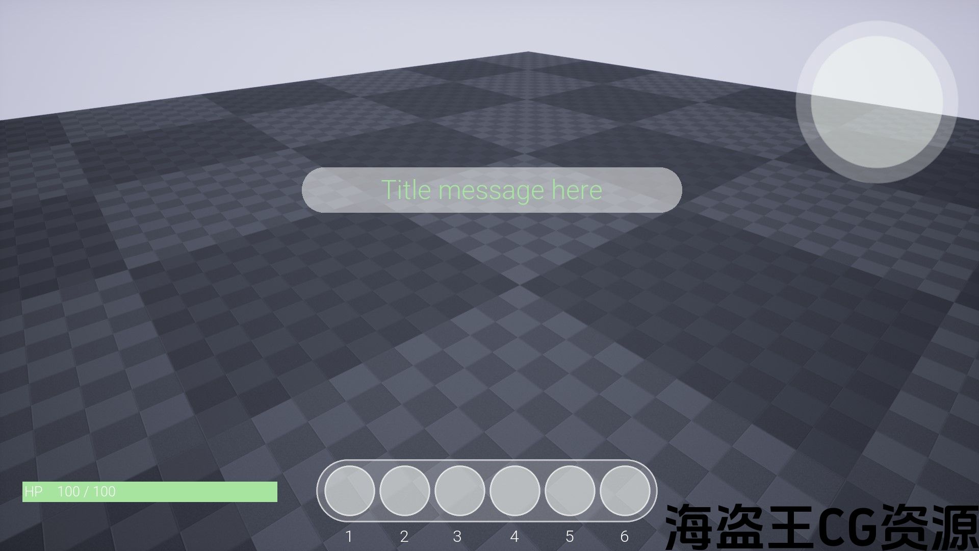
Video (demonstration + tutorial)
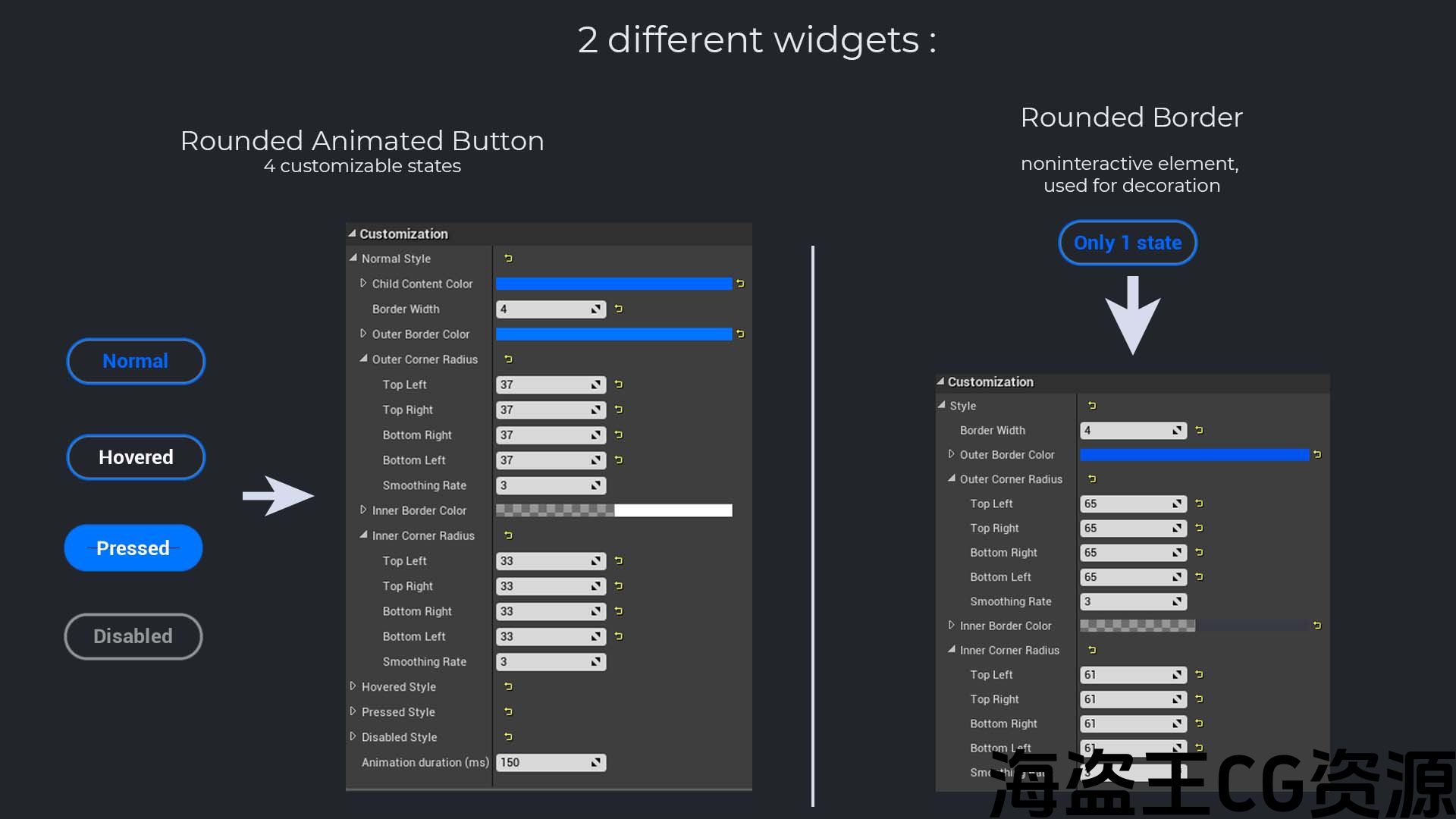
This plugin allows you to easily create and customize buttons and borders with rounded corners in the UMG editor. Two widgets are included in this plugin, a RoundedAnimatedButton that has 4 states (Normal, Hovered, Pressed, and Disabled) and a RoundedBorder with only one state.
Each state of the widgets is fully customizable so you can create an infinite number of different buttons and borders. In each state, you can customize:
- [Button only] RGBA color of the child content (can be an image or a text).
- Border width
- Outer RGBA color
- Outer corner radius (each corner is independent and you can adjust the SmoothingRate to create a gradient, a shadow, or just an anti-aliasing)
- Inner RGBA color
- Inner corner radius (same properties than outer corner radius)
Additionally, for the RoundedAnimatedButton, a transition animation is automatically generated between the Normal and the Hovered state, so you can customize the animation duration.
The RoundedAnimatedButton extends the basic UMG Button, so all features of the basic UMG button are available in the RoundedAnimatedButton (like add sounds, etc.). Same for RoundedBorder and basic UMG Border. They are really quick and easy to add to your own game and can be used in UMG/Blueprints as well as C++. The project example presented in the video contains several Blueprint examples.
Example Project: https://drive.google.com/uc?export=download&id=18N5Ryd7XUdhFXLRG3O_v4qIP4pTgF_uH
Please, join the Discord community for help, bugs, or suggestions: https://discord.gg/W5cRk5Q
此插件允许您在UMG编辑器中轻松创建和自定义带有圆角的按钮和边框。 这个插件中包含两个小部件,一个具有4个状态(正常,悬停,按下和禁用)的RoundedAnimatedButton和一个只有一个状态的RoundedBorder。
小部件的每个状态都是完全可自定义的,因此您可以创建无限数量的不同按钮和边框。 在每个状态下,您可以自定义:
- [仅按钮]子内容的RGBA颜色(可以是图像或文本)。
- 边框宽度
- 外RGBA颜色
- 外角半径(每个角都是独立的,您可以调整SmoothingRate以创建渐变,阴影或只是抗锯齿)
- 内RGBA颜色
- 内角半径(与外角半径相同的属性)
此外,对于RoundedAnimatedButton,将在正常状态和悬停状态之间自动生成过渡动画,因此您可以自定义动画持续时间。
RoundedAnimatedButton扩展了基本的UMG按钮,因此基本的UMG按钮的所有功能都可以在RoundedAnimatedButton中使用(如添加声音等)。). RoundedBorder和基本UMG边界也是如此。 它们非常快速和容易地添加到您自己的游戏中,并且可以在UMG/蓝图以及C++中使用。 视频中呈现的项目示例包含多个蓝图示例。
示例项目:https://drive.google.com/uc?export=download&id=18N5Ryd7XUdhFXLRG3O_v4qIP4pTgF_uH
请加入不和谐社区寻求帮助、错误或建议:https://discord.gg/W5cRk5Q
评论(0)